
Our colors
Our color palette is clear, confident, and uniquely ours.
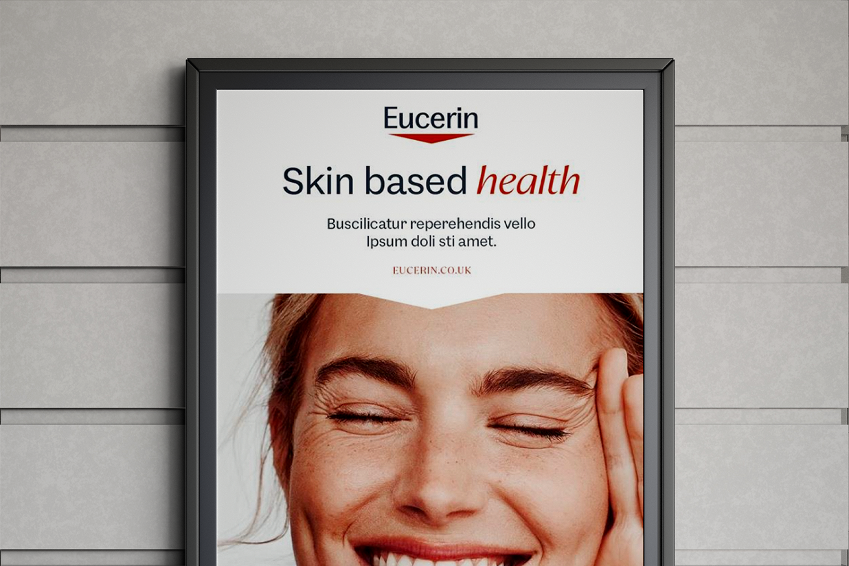
At its core stands red – derived from our iconic logo as a strong brand asset. Brightened and modernized, it ensures bold recognition while white and grey bring clarity, medical credibility, and precision to every application.
Brand colors define logo, typography, and backgrounds. White space ensures clarity and trust.


Franchise Colors support navigation and indications; always used sparingly and in context.


APPLICATION
How to use colors
Spacing, Imagery, Colors
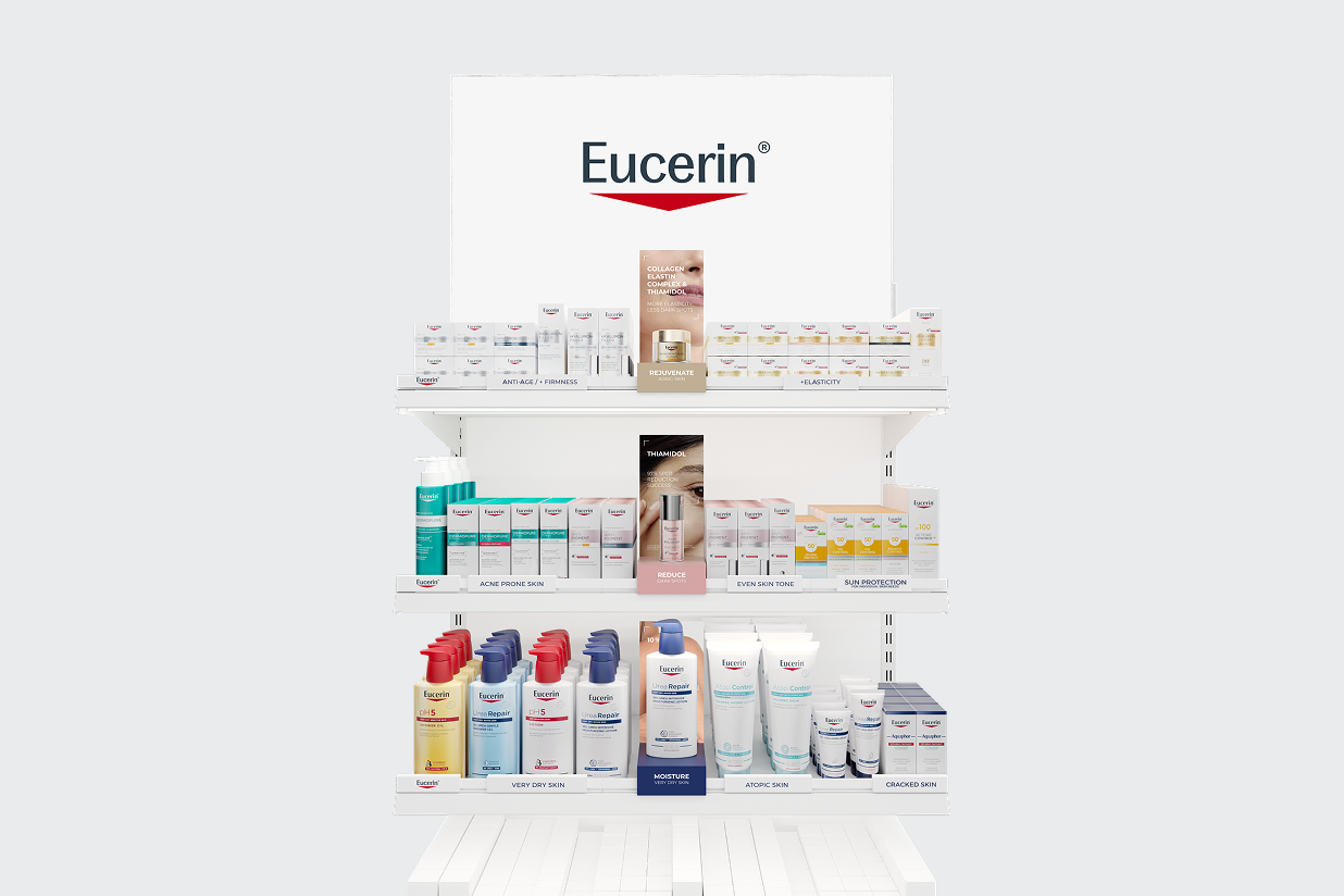
Franchise colors
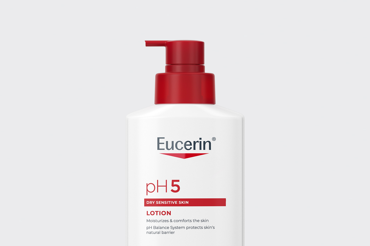
Our red has evolved
DONT'S
Don't do this


Bring the brand to life

FAQS
When do we start with the roll-out?
How long will the full logo transition take?
Are we dropping the "Life-Changing Power of Dermatological Skincare" proposition?
Not at all. Life-Changing Power remains our brand purpose — it's what drives us. But it's not being used as a consumer-facing brand claim.
Instead, you'll see the life-changing impact reflected throughout our communication in more authentic and relevant ways.
Will our brand type be available in other languages?
CONTACT
