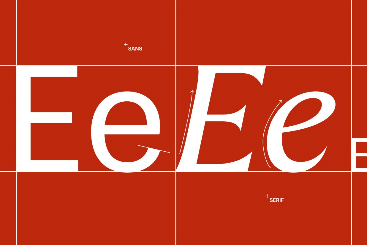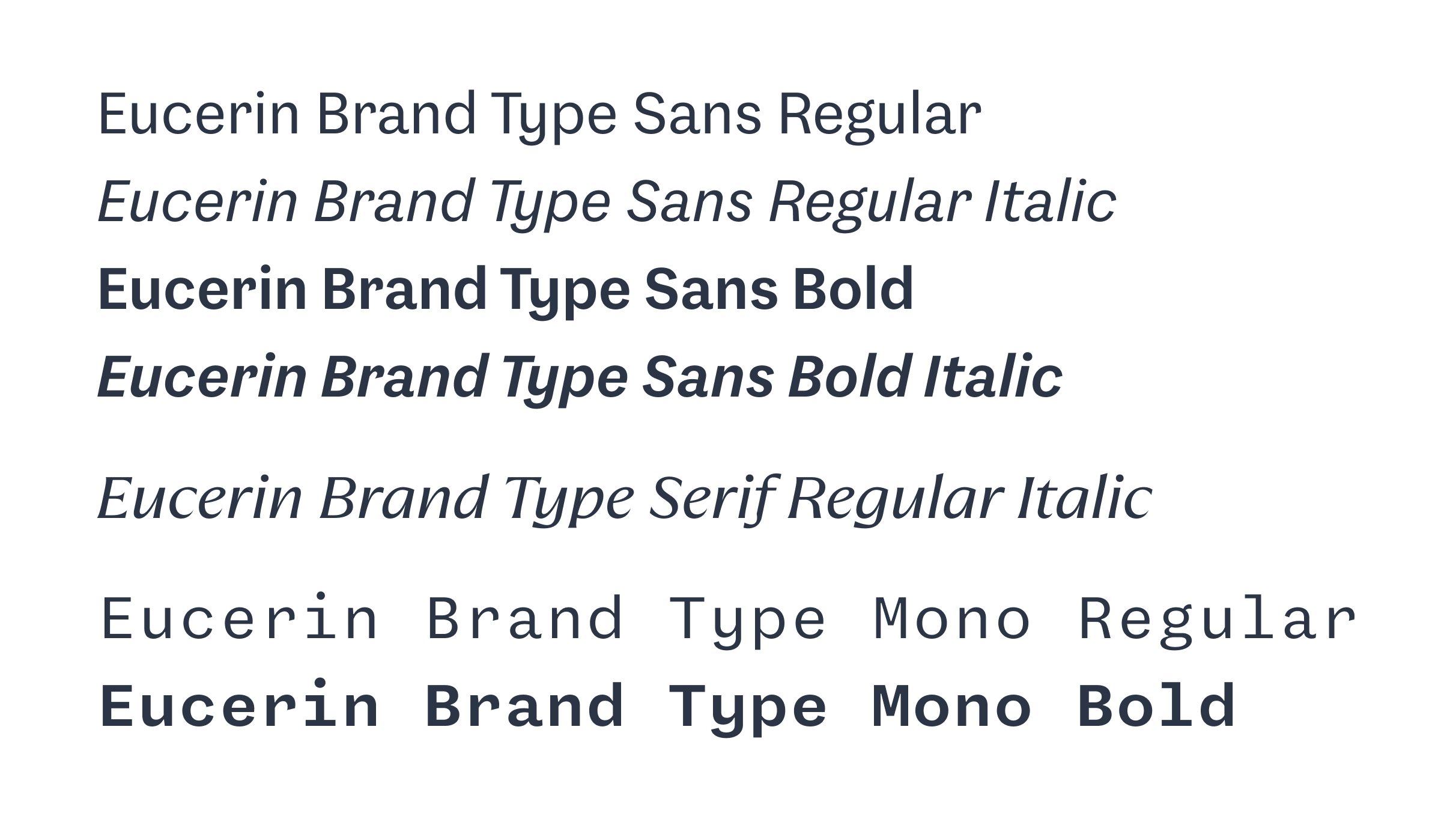
Overview
The Eucerin Brand Type comes in different formats and styles for every use: Whether you're working in digital, layout, or office environments, there's a format that fits. In this chapter, you’ll learn how to apply each typeface purposefully and consistently.